Project date: Spring 2012
For Footnotes' 10th anniversary I designed and built a fully responsive site to allow for easy viewing on any current device, and future-friendly for devices yet to be deployed. I also built the site using mobile-first methods so smaller screens with bandwidth limitations wouldn't need to download as many images and scripts. After building I installed the Perch CMS for easy maintenance.
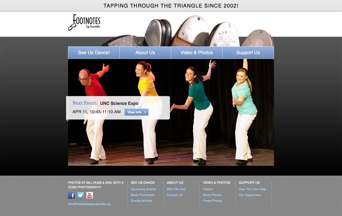
Homepage
Featuring a responsive image slideshow of actual Footnotes performances and custom photography, the homepage's main call-to-action is to see the group's next event.

Upcoming Events
Light blue is intentionally used as an indicator of website links with orange as an accent showing where the user is in the navigation. The decorative sidebar image on interior pages is built in as a CSS background, which doesn't load in the mobile view to save bandwidth.
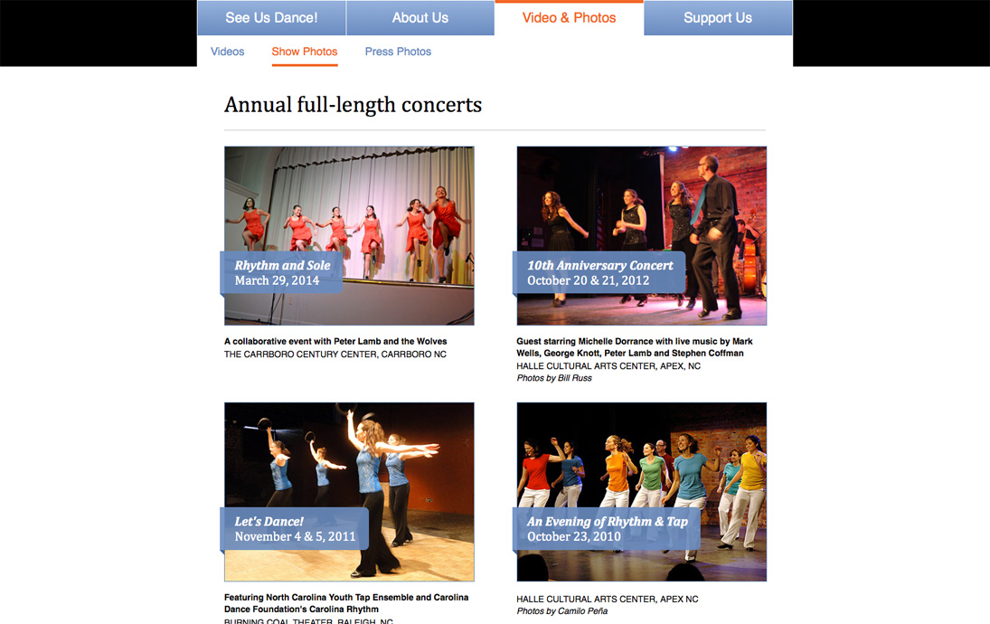
Show Photos
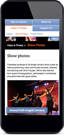
The photo galleries feature CSS-generated "ribbons" for the show titles and responsive image thumbnails and sliders.
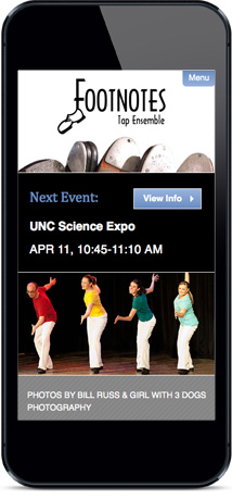
The mobile view of the homepage reorganizes the content to show the upcoming event link closer to the top, creates a toggled menu opened at the top-right and uses a random PHP image loader rather than the larger image slideshow.
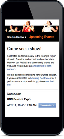
Scrolling down in the mobile view you can see a breadcrumb trail appears in lieu of the visible subnav in the desktop view. The "Next event" link takes the user directly down to the event details.
The toggled main menu uses the same HTML build as the desktop view, but styled with CSS for mobile use, and slides up and down with jQuery.

Sketch of the content organization for the Upcoming Events page in wide and narrow views.